


We may receive a commission when you use our affiliate links. However, this does not impact our recommendations.

Apply layers of milk paint to add depth and contrast to your work.
A visitor asked, “Paint over wood? Aren’t you obscuring wood’s natural beauty?”
There are two assumptions behind these questions: Wood is naturally beautiful. Paint is thick, looks like plastic and hides whatever it covers. I’d say both assumptions are partially correct.
Paint can unify disparate woods, or add color and variety. It can even highlight beautiful woods. In this article, black over red paint provides a frame, showcasing this table’s unpainted, shellacked walnut top.
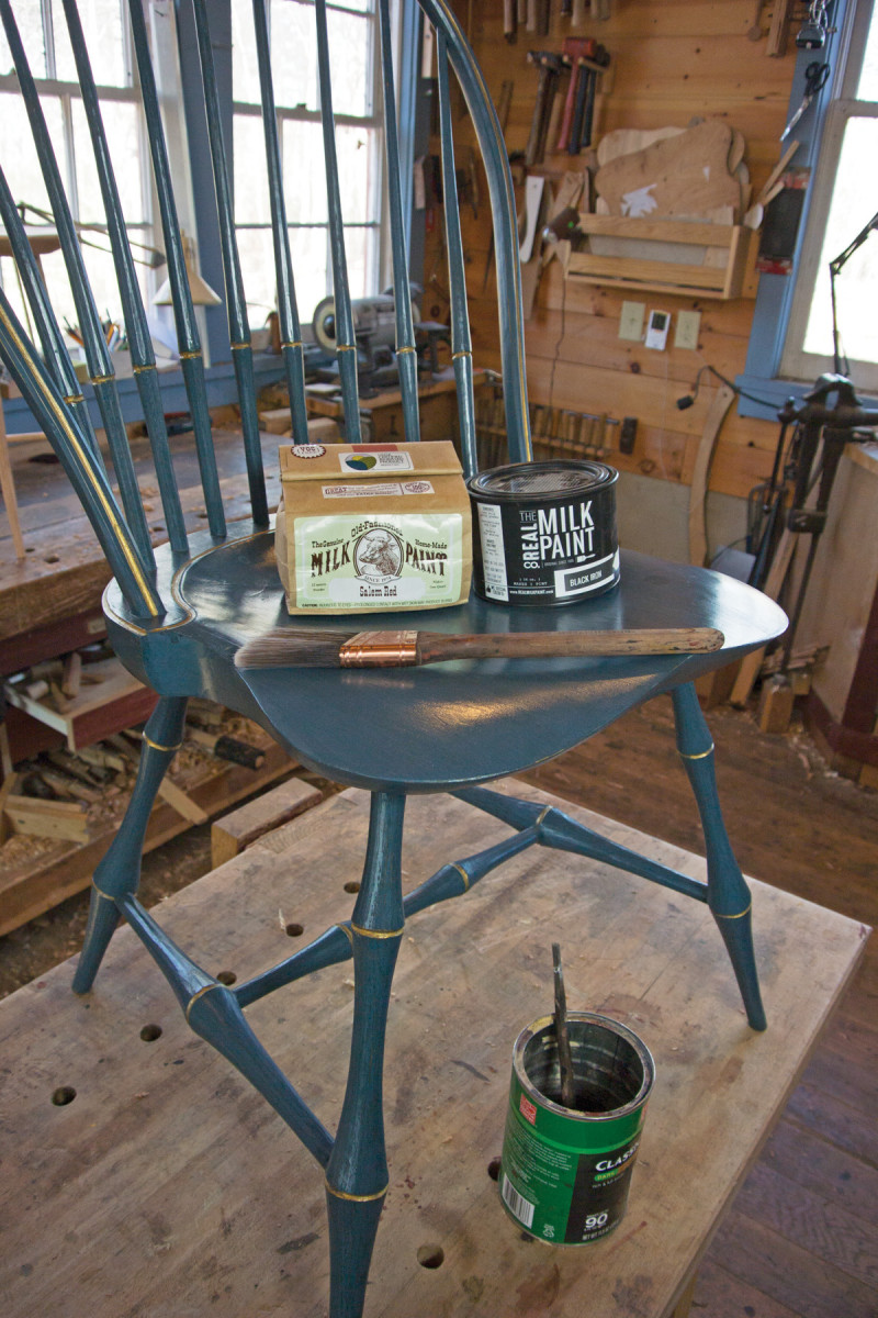
Why Milk Paint?
Milk paint’s thinness requires a number of coats. It dries to a rough and chalky surface, and needs to be burnished to add depth and smoothness. Plus, the matte finish of milk paint sometimes needs to be covered with another finish (if you like a shine). So why use it?
If most paints are a woolen coat, milk paint is a silk dress. Exceptionally thin, milk paint allows every pore and growth ring in the wood to show through. Its thinness also allows the use of washcoats, which are a thin layer of color (black, in this case) painted over a different base color (red). The base color peeks through, adding depth.
True milk paint comes as a powder and is made with milk casein, pigments and lime or borax. Some petrochemical paint manufacturers sell a pre-mixed “milk paint” that is actually matte acrylic paint; it doesn’t have the thinness of true milk paint.
In this article, I show you how to apply my most popular finish to a table – two or three coats of red, to add warmth and depth, under a black washcoat. A final black streaking coat gives the subtle appearance of graining – but also allows the wood’s grain to show through. I then burnish the paint to raise a sheen and apply shellac and wax to add luster.
So follow along with the pictures and give it a try yourself. I think you’ll see that traditional milk paint has a well-deserved place in the modern shop.
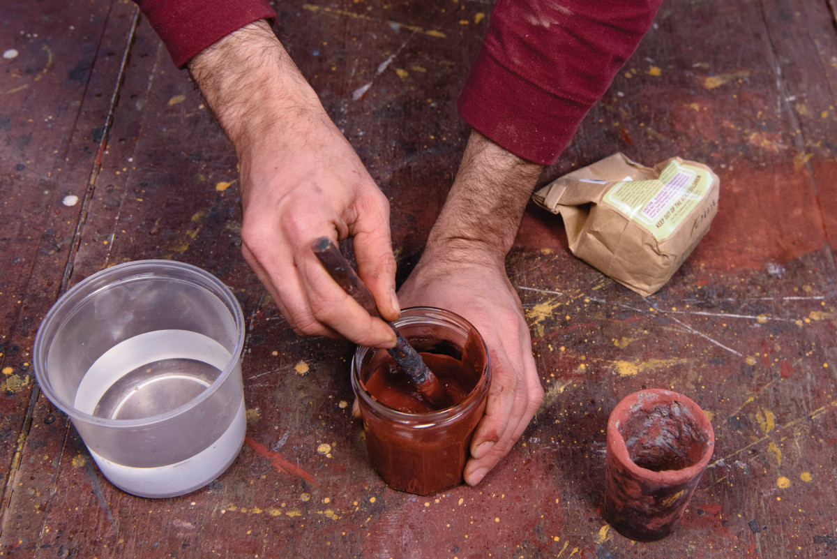
1) Mix it up. Mix paint one-to-one with hot water. The ratio of water to paint can vary by brand and color, but this is a good starting point. Stir it thoroughly with a stick then let it sit for an hour or so to allow any undissolved paint particles to soften.

2) Skim the foam. There will likely be a layer of foam on top of the paint. This is difficult to paint with, so spoon off the foam until you get down to the watery-looking paint (you’ll see the difference).
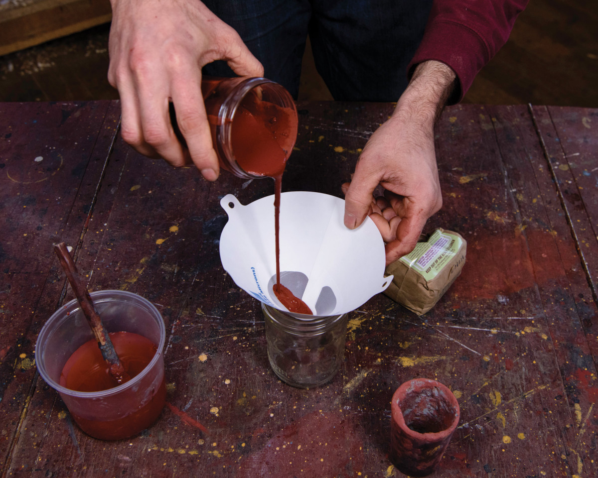
3) Strain it. To remove any solid particles, strain it through an automotive paint strainer into another container. A piece of paint-strainer bag from the hardware store also works well. Thin it as necessary, aiming for the consistency of thin cream (measuring roughly nine to 11 seconds with a #4 Ford viscosity cup). Add water slowly; small quantities of water can profoundly change the viscosity.
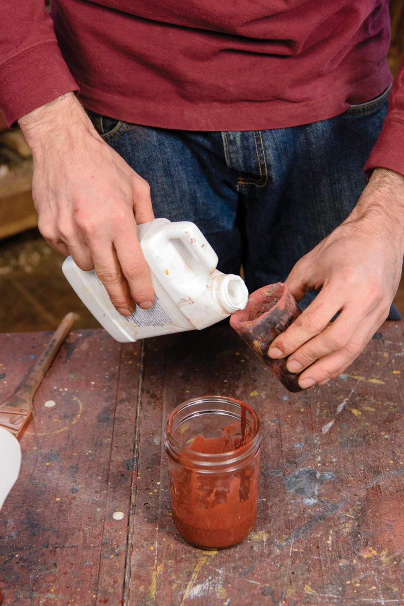
4) Some adhesion necessary. When painting dense woods or woods with pitch (pine, maple, etc.) stir adhesion additive into the first coat to prevent the paint from peeling. The additive is sold by milk paint manufacturers; mix according to the instructions. It changes the look of the paint, so use it only in the first coat.
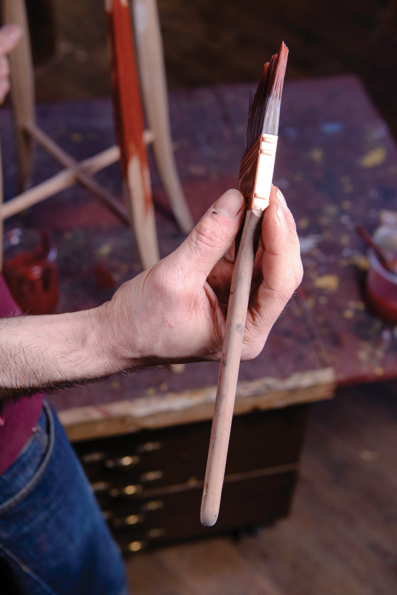
5) Different strokes. I use a Purdy 1 1⁄2″ sash brush with synthetic bristles from the hardware store to apply the paint. Hold it loosely like a pencil, with your fingers on the metal ferrule. The amount of paint on the brush is quite important. This is controlled by how far the brush is dipped into the paint and how much paint you wipe off the brush. The smaller the surface being painted, the less paint should be on the brush. Generally, I dip the bristles 1⁄4″ to 1⁄2″ into the paint, then wipe one or both sides against the lip of the jar.
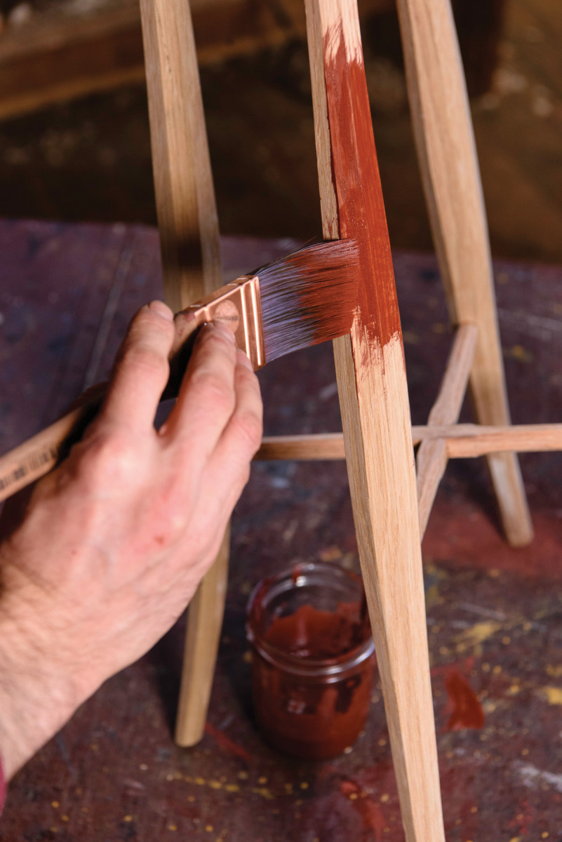
6) Spread it out. You’ll leave a puddle wherever you first put your brush, so start on relatively flat area, move on, get the brush drier, then come back and clean up the puddle.
7) Light touch. Try to touch the wood gently with only the last 1⁄4″ of the bristles. This reduces splatter and leaves a smoother surface.
8) With the grain. At first you can paint in whatever direction is easiest, regardless of grain direction (above), as long as the final strokes are parallel with the grain and as long as possible (below). Try to land the brush gently while it is already moving forward, like an airplane rather than a helicopter. This helps keep brush marks to a minimum.
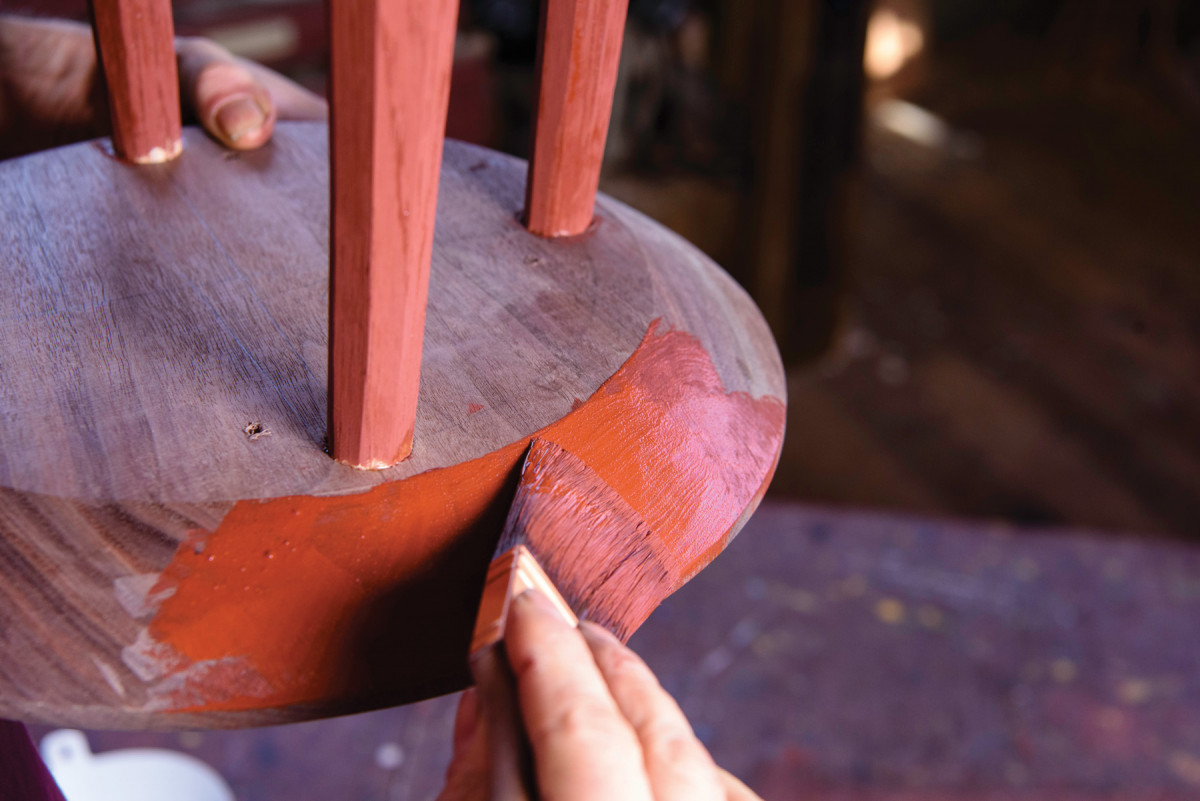
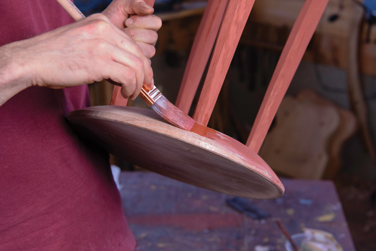
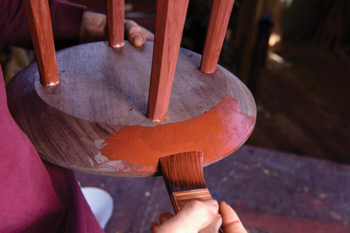
9) Low-angle brushing. Keep paint off an adjacent surface by holding your brush at a low angle relative to the surface you are painting. I’m leaving the underside and top of my table unpainted.
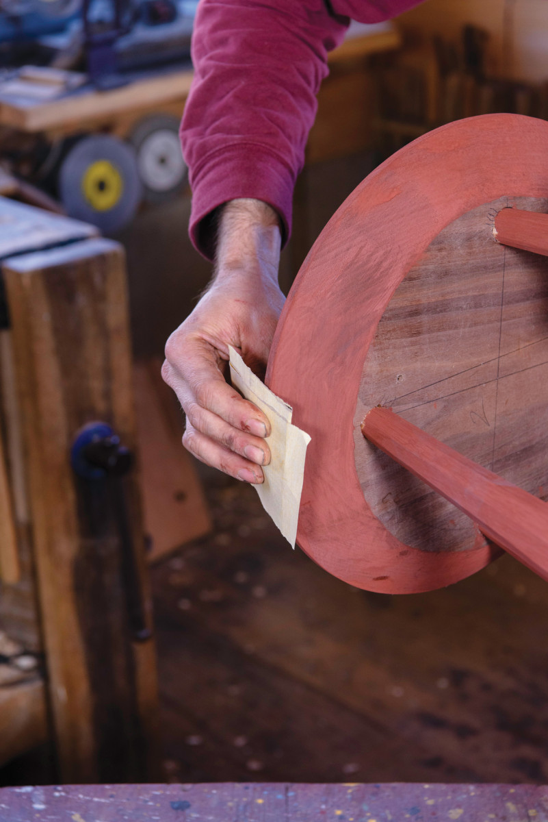
11) Further coats. On subsequent coats, use paint without adhesion additive, and paint exactly as before. Sometimes two coats is enough, but I usually need three and sometimes four coats. Continue to sand raised grain between coats as needed.
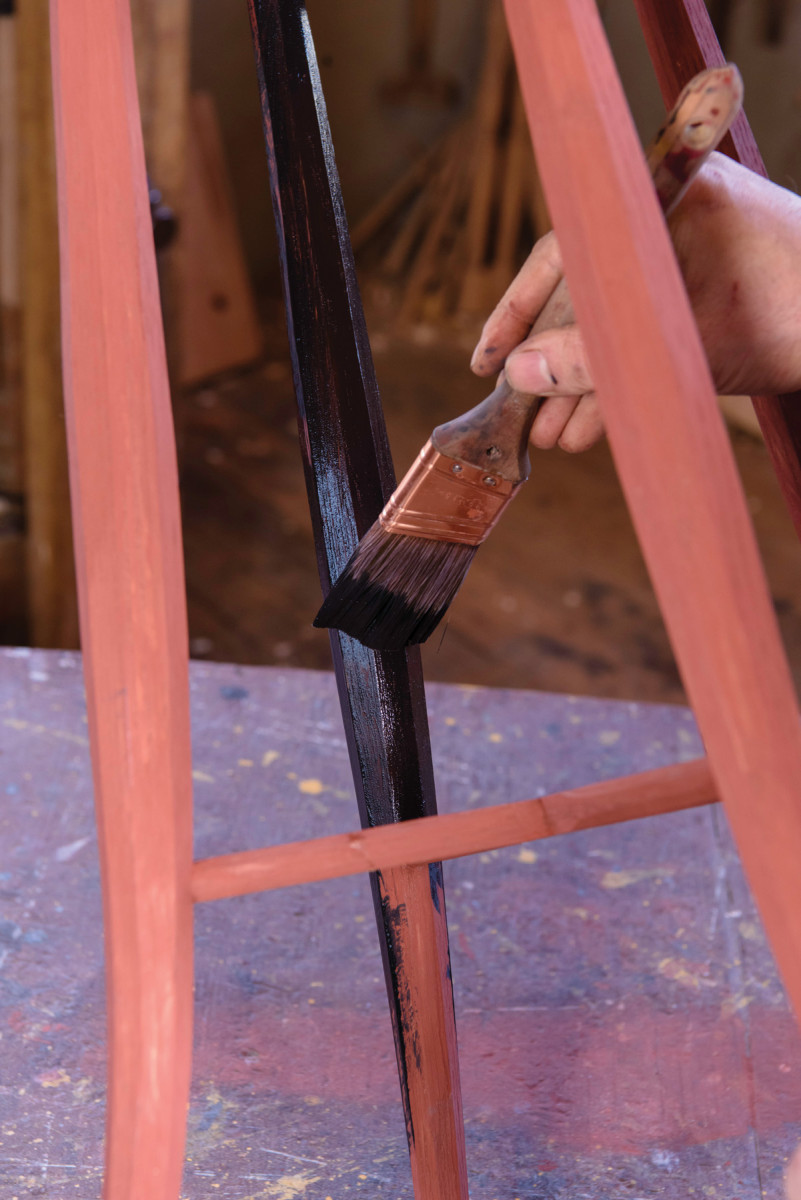
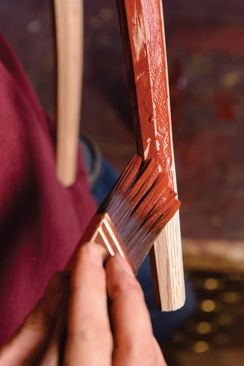
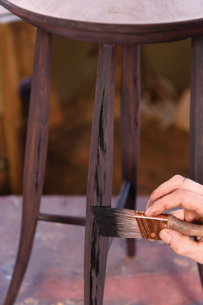
12) Black wash. A washcoat is a coat of paint applied thin enough to see through. The paint should be so thin that the red undercoat can just barely be seen through the black as you are painting it on. The washcoat has to go on very evenly or it will look splotchy.
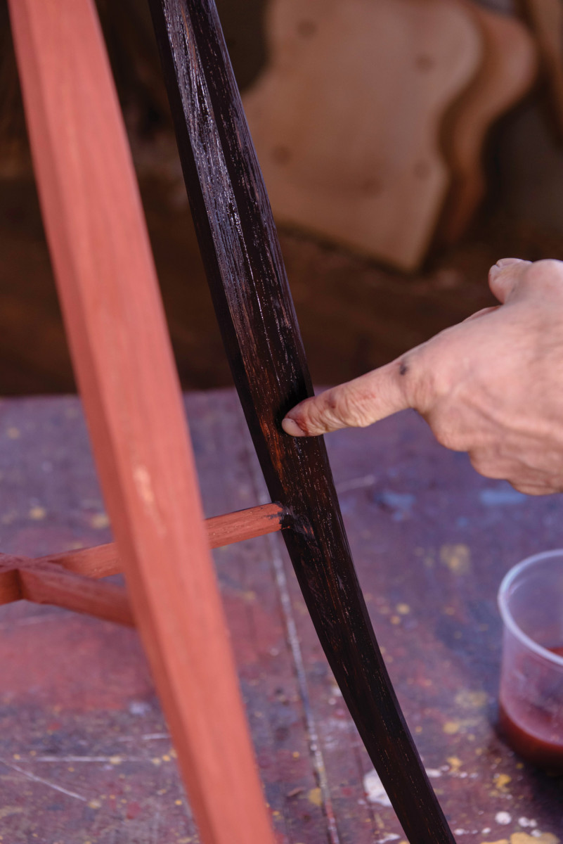
13) Brisk painting. The washcoat needs to go on quickly, yet gently. It should be a distinct layer on top of the undercoat. Working the paint too much will soften the base coats, mixing it into the washcoat (as seen where I’m pointing). A barrier coat of shellac between the two colors will prevent this problem and might be useful on your first few paint jobs. But don’t go back and fix any missed spots – you’ll make a blotchy mess. Missed spots can be covered on the streaking coat, or even left altogether.
14) A nice streak. I follow the washcoat with a streaking coat, where two-thirds of every surface is painted. It’s almost like graining. Barely touch the bristles to the wood, so some of the bristles touch and some don’t. This sounds tricky, but it’s no more difficult than the washcoat. Anything that results in long lines going with the grain looks good. Stutter marks across the grain don’t look as good.
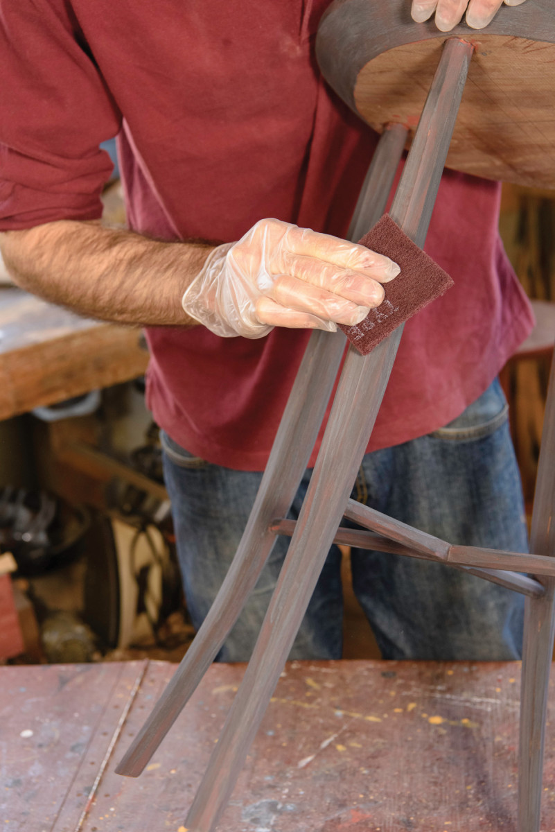
15) Smooth it out. In its natural state, milk paint looks like chalk and feels like sandpaper. It needs to be burnished (but wait a day or so for the paint to completely dry). Use a maroon Scotch-Brite pad to rub it down. You might rub through the paint on sharp corners, but this is a side effect (if a somewhat pleasant one), not the goal.
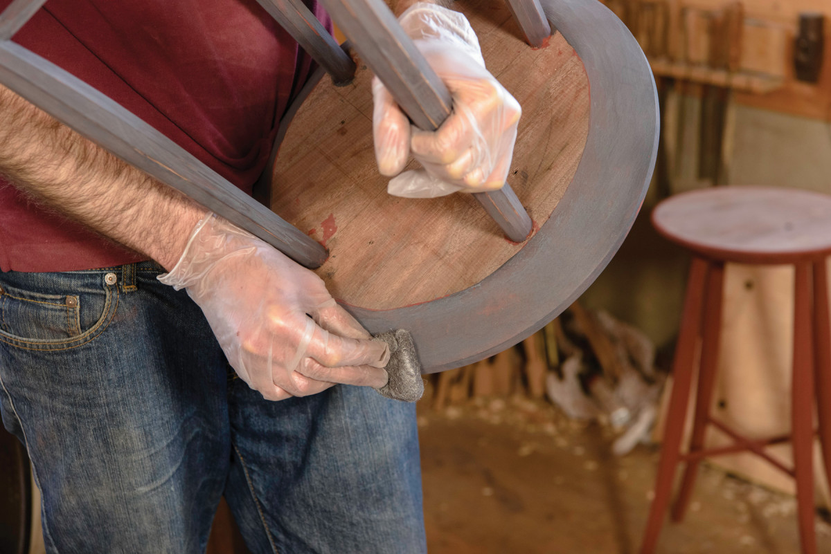
16) Steel wool. Some paint brands (such as Old Fashioned Milk Paint) will burnish to a fairly high sheen. Test your paint to see if #000 steel wool has any effect. With steel wool, pressure is what causes the sheen, so push on the wool as hard as you can. This will add luster and visual depth to the finish. Wear marks, however, are not my objective; I find that objects wear fast enough without accelerating the process.
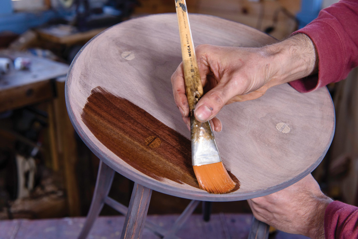
17) Finishing touches. I use a thin mix of shellac as the finish for the unpainted top, as well as for the topcoat over the paint. A medium-dark shellac is nice over dark paints, but a light-colored shellac is better for lighter paints. Wiping varnish also works well.

18) Top it off. Shellac, and some wiping varnishes, dry extremely glossy and need to be cut back with #000 steel wool. Dip the wool in wax for lubrication. Rub it on and wipe off the excess. Then let the wax dry for a couple of minutes before buffing with a rag. Paste wax applied over shellac tends to leave white dots in wood pores, so I use BioShield’s liquid wax mixed with coconut oil. It smells slightly tropical!
All the colors. Milk paint is available in an array of hues – plus you can combine them for custom colors. Working with them is a lot of fun – give it a try!
Here are some supplies and tools we find essential in our everyday work around the shop. We may receive a commission from sales referred by our links; however, we have carefully selected these products for their usefulness and quality.


