We may receive a commission when you use our affiliate links. However, this does not impact our recommendations.
Of all the variables of design, context is the easiest to miss. That is one of the powerful things about using SketchUp, you can easily compare one piece to another, add a human figure to the model or place the piece in a room setting. Seeing is believing and knowing is better than guessing. Yesterday I presented three wardrobes and invited readers to guess at their size.
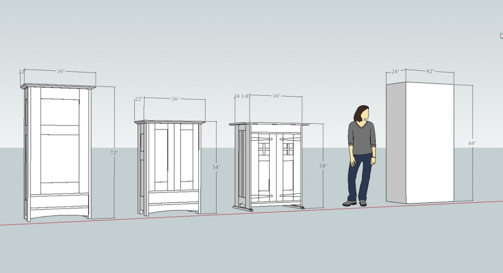
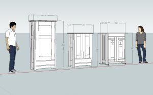
That was inherently unfair on my part because there was nothing in the images to give a sense of scale. The two wardrobes on the right appear much larger than they really are. This is something that designers in the early 20th century, guys like Gustav Stickley, Harvey Ellis and Charles Greene were really good at. These pieces have a commanding presence when viewed in isolation, but in real life appear quite different. The two cases on the right are nearly identical in size, yet one appears short and squatty and the other appears to be tall. The piece on the left has the same footprint as the one next to it, but is 18 inches taller.
Way back when I was in design school, one of the lessons was to always explore variations, even if you were absolutely certain you had a great idea going in. Messing around with things you don’t think you like will teach you a lot about what you do like. Different arrangements of elements like doors (and the stiles, rails and panels) make a huge difference in the end, and this is another benefit to using SketchUp. The lines you see in the model might be fully detailed parts, but they can also be quickly drawn lines. In my SketchUp classes, we make a box the overall size of a proposed project, make several copies, then experiment. It’s a quick way to see if the original idea holds up, or if there are better alternatives.
 Yesterday there were several guesses that are represented in the box at right, taller and wider than the actual pieces. A case that size would really dominate the average room, would use a lot more material and would be a lot harder to get up the stairs and into the bedroom. With SketchUp, we can try different things with no investment in materials and a minimal investment in time. The results are better furniture.
If you want to learn how to use SketchUp, there are several posts on this blog as well as these resources in our store. I also write about SketchUp on my personal blog, ReadWatchDo.com
Here are some supplies and tools we find essential in our everyday work around the shop. We may receive a commission from sales referred by our links; however, we have carefully selected these products for their usefulness and quality.


My preference would be influenced by what you want to do with it, where it goes in the house.. but overall, I like the one over my Megan.
“This is something that designers in the early 20th century, guys like Gustav Stickley, Harvey Ellis and Charles Greene were really good at.”
These guys did not have “Sketch-up” and I wonder if this was advantageous in some ways, because they were forced to think and develop a more intuitive sense of proportion, scale, and beauty. With time that part of the brain can get to the right proportion very quickly.
Armoires are very efficient; far better than a low dresser of drawers in using space. Your design is ideal for maximizing usable volume.
Based on 3/4 or 4/4 dividers and frame, my estimate was 71 to 76 inches height. But the width at about 32 to 34 inches was way too wide for a single door. Two doors can be a mild nuisance at that width because both drift shut in one of our armoires having only drawers. One piece is 40 inches and converted to a TV cabinet. A third is 38 inches. They have 13.5 to 15 inch doors. I ignore the cornice wings, etc. in measuring.
A 30 to 32 inch single door severely limits the number of bedrooms it will work in; and it still drifts, with greater mass. It will also make the piece “feel” much bigger than it is, and yours is huge at 6-feet high. Two doors will help considerably. Maybe, a second drawer to proportion the doors.
I certainly cannot argue with your explanations. However, here is where my observations came from. My ceilings are 9′ tall, and the room is 16’x20′, so a larger wardrobe would not have been out of place. In fact, when we had California Closets upgrade the room (since our house, too, has almost no closet space anywhere and especially in the master bedroom), they installed closets that are 8′ tall and go across the entire 16′ expanse of the wall. And up in the attic there is an old block and tackle pulley that obviously had been used in the past to haul up large and heavy furniture. So as you pointed out, it is all a matter of perspective.
Maybe a combination of open and closed storage is a better way to go. That approach would substantially reduce the depth needed for a functional wardrobe. Lots of great ideas here … http://www.impressiveinteriordesign.com/useful-design-ideas-to-organize-your-bedroom-wardrobe-closets/