We may receive a commission when you use our affiliate links. However, this does not impact our recommendations.
 As a material object, a piece of furniture reflects the taste of its designer, the skill of its maker and larger cultural influences. For example, Shaker furniture shows the elegance of simplicity and the value of using local woods, while Utility furniture derives from post-World-War II scarcity.
You don’t need to be a cultural historian to learn from a piece or style; examine an item with an eye to see how it was joined and we can see whether it was produced by hand, if it was assembled with care and if and how it was designed to achieve a particular effect. Once we “read” a piece for its lessons, it’s a short step to applying those lessons to our own work, making us better designers and makers. The wide range of expression on display in Mid-Century Modern furniture provides a rich body of work for such study. Here are five lessons from Mid-Century Modern furniture with applications beyond building in the style.
1. Mix materials.
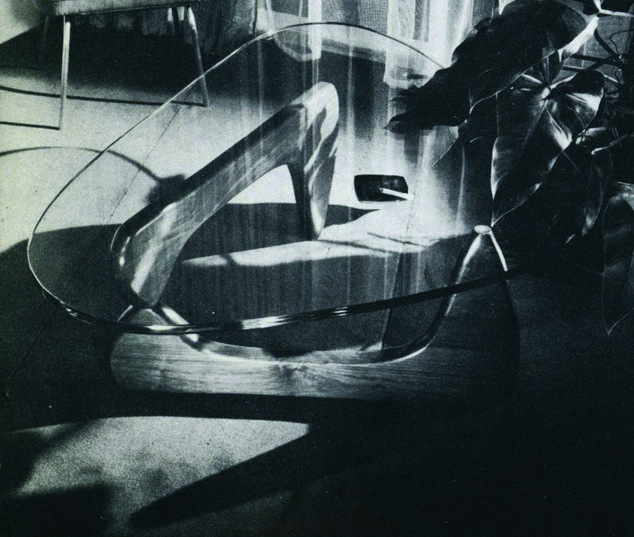
Some of the era’s most distinctive designs combine materials, juxtaposing wood and glass (as in Noguchi’s coffee table for Herman Miller) or wood and metal (as in the Eames’ lounge chair). This juxtaposition creates a visual interest while allowing the designer to take advantage of the unique characteristics of those materials. The transparent top of Noguchi’s table, for example, reveals the full impact of its sculptural base, an effect lost if the top were opaque.

Isamu Noguchi’s coffee table for Herman Miller takes advantage of the glass’s transparency to show off the simple, sculptural base.
2. Contrast shape and texture.
The tension between contrasting visual textures can heighten a design’s impact. Finn Juhl took great advantage of contrast: his work often juxtaposes sculptural shapes with angular ones, adding dynamism and drama to his designs.
3. Don’t be afraid of plywood.
The frequent use of sheet goods in Mid-Century style can come as a shock if you’re used to building in the Arts & Crafts or Shaker styles which tend to emphasize the use of solid wood. But Mid-Century design shows us that sheet goods can be attractive as well as practical, whether in the melamine tops of the Eameses’ surfboard coffee table or the figured veneer of countless sideboards.

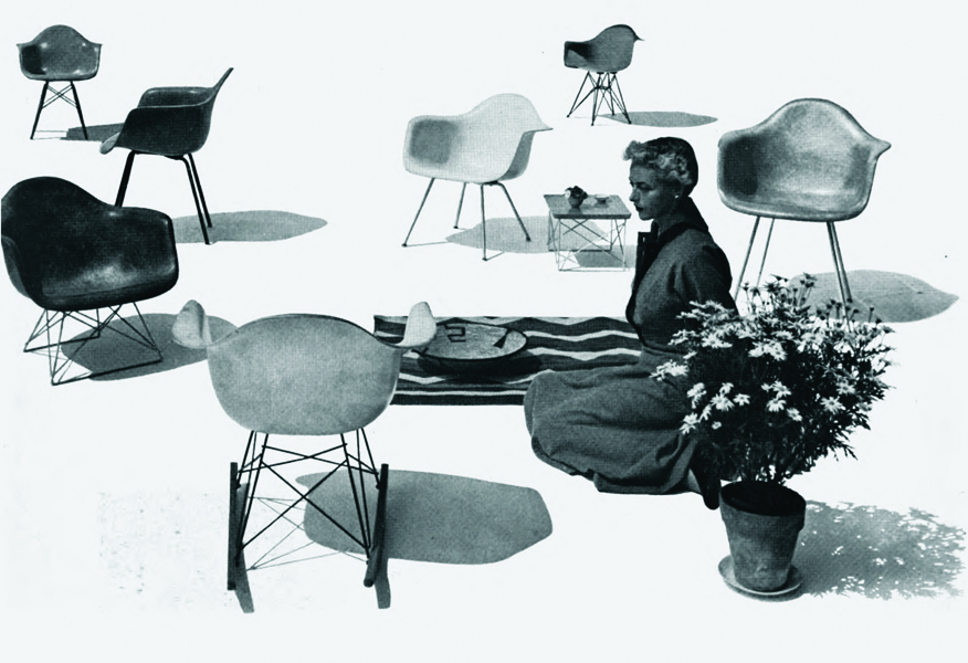
Charles and Ray Eames took full advantage of the properties available from an array of materials to execute their designs. Their fiberglass and metal chairs provide durable and easily portable outdoor seating.
4. Use the joinery you can.
Modernism and Arts & Crafts share an interest in minimal and functional design, but where Arts & Crafts makers emphasized the importance of handwork, Mid-Century designers and makers didn’t hesitate to leverage industrial methods of production. At the most basic level, this means leveraging dowels where an Arts & Crafts piece would use a mortise and tenon joint. More generally, it means you shouldn’t feel locked into using one joint where another would serve just because that joint seems more “authentic.”
5. Any finish is fair game.
From the soap and oil finishes of Danish modern to the industrial finishes of American makers, Mid-Century Modern furniture uses a variety of finishes, in the same way it features an array of joinery and materials. So feel free to use those finishes that suit your requirements, inclination and capability without worrying unduly about an “authentic” finish.
— Michael Crow
You can purchase Michael Crow’s DVD “Building Techniques in Mid-century Modern Furniture,” on Amazon. As an Amazon Associate, we earn from qualifying purchases made through affiliate links.
Product Recommendations
Here are some supplies and tools we find essential in our everyday work around the shop. We may receive a commission from sales referred by our links; however, we have carefully selected these products for their usefulness and quality.
 As a material object, a piece of furniture reflects the taste of its designer, the skill of its maker and larger cultural influences. For example, Shaker furniture shows the elegance of simplicity and the value of using local woods, while Utility furniture derives from post-World-War II scarcity.


