We may receive a commission when you use our affiliate links. However, this does not impact our recommendations.
Adapt a furniture plan with your eye.
I think of plans as sort of a roadmap. They were a big part of my early work as a machinist and later as a woodworker. We had an unwritten rule in the machine shop. Never touch a job if it didn’t come with a drawing. Admittedly, what qualified as a drawing was sketchy. It could be just a crude scribble on a napkin with a few dimensions, or a full-fledged engineered print. Yet drawings insured one thing above all. That the maker would turn out something exactly as ordered. The correct size, correct material all made precisely to specifications. When I took up woodworking and wanted to build a table, it began with a search for plans from books or magazines. It worked well for my first few projects, but this “plan as a roadmap” idea began to fall apart. In real life, a roadmap offers alternate routes if you want to take a detour or go off-road. A woodworking plan offers no clues to go about building something shorter or wider or changing things up a bit. That doesn’t seem like much of a problem until you consider that slight changes in the size of parts can have a dramatic impact on how something looks.
For most of history, builders had a working knowledge of how to use proportions and simple geometric shapes to create pleasing designs. This gave them freedom to improvise and make sound aesthetic choices. In this article I want to explain how I used this approach to design and build a contemporary chest of drawers.
Getting a Rough Idea
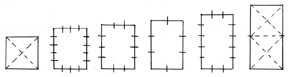
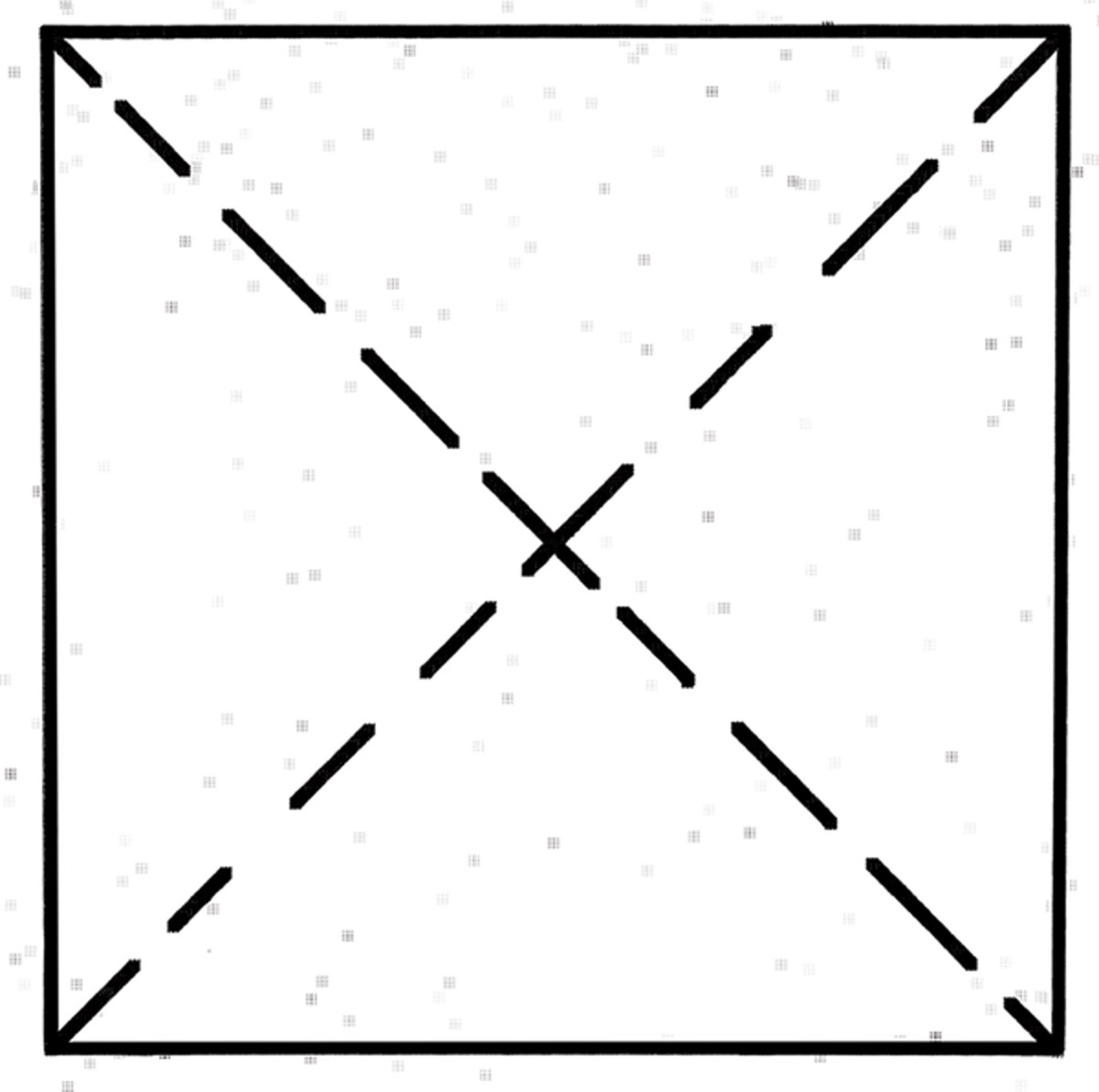
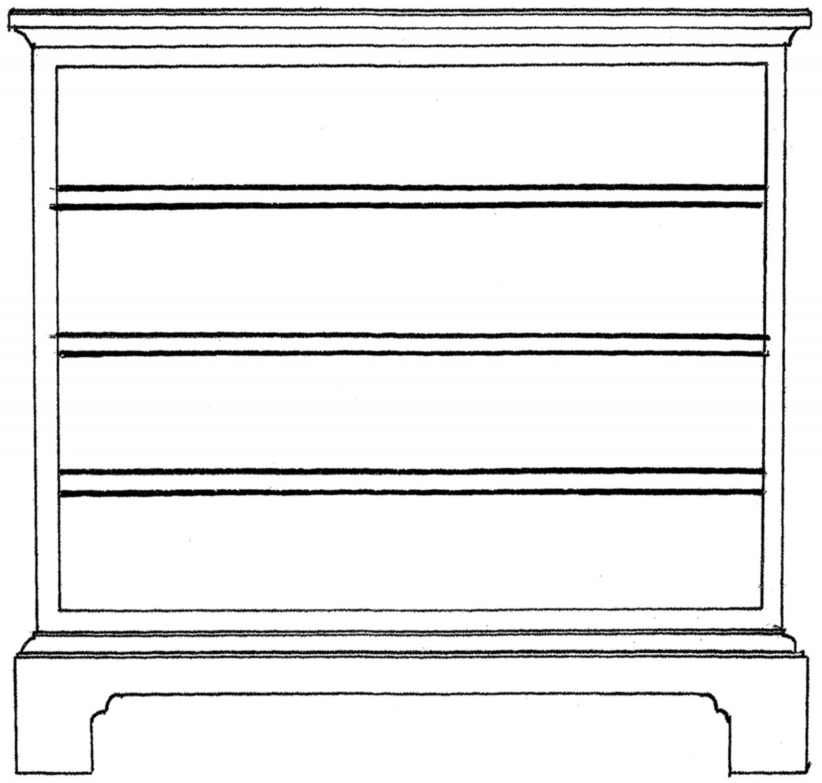
1. These simple rectangles can be used to establish the form that underlies a wide range of case furniture designs.
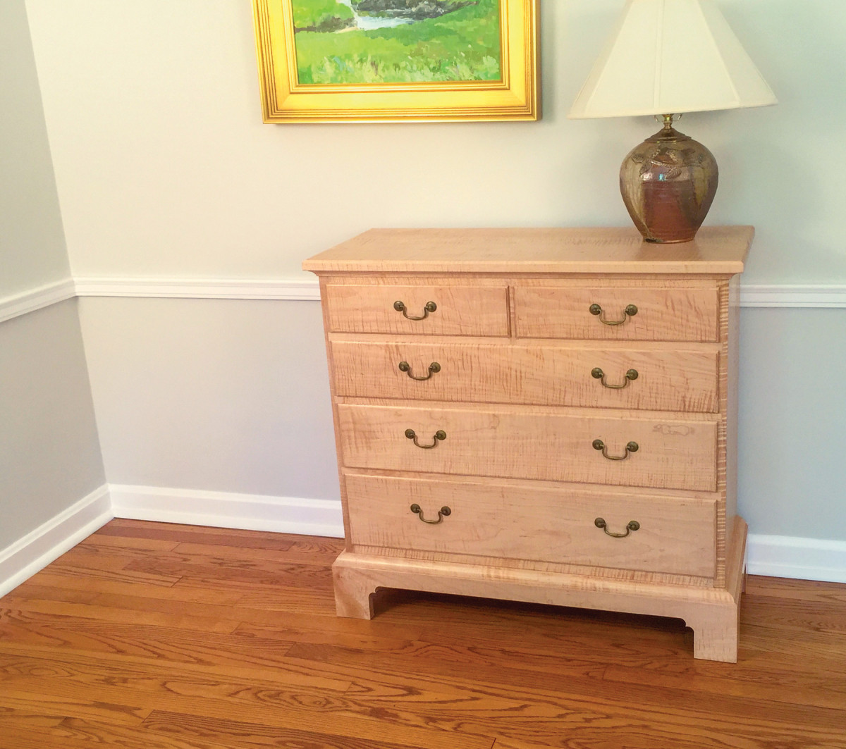
We have a foyer in our home and my wife Barb asked me to make a small dresser to fit in the space. It had to be narrow but with a top large enough for a lamp and a place to toss the day’s mail. She also wanted something a bit more contemporary yet still function as a chest of drawers that would provide some much needed storage. Lastly, since it’s the first thing you see when you step in the front door, it had to be a stunner.
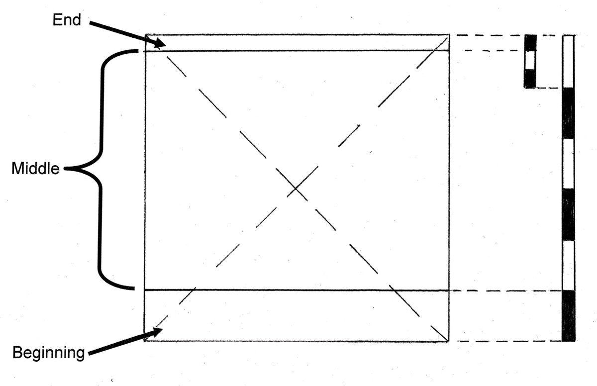
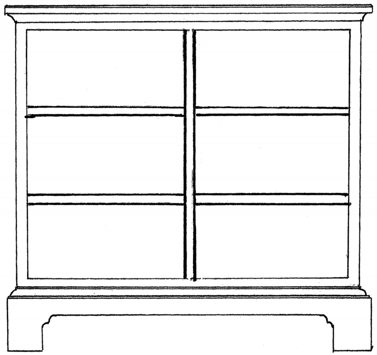
2. Hidden simplicity. The untrained eye might not recognize this dresser is built around a square.
She has a good eye for proportions, and I asked her to stand where the dresser would sit and help me to rough in the general form. With her arms outstretched, she indicated how wide it should be and she also held her hand up to give me an idea of the height and also the depth. Armed with this information, I established the simple rectangular shape that lies beneath the skin of the design. Traditional builders and artisans relied on a small handful of simple rectangles to set the overall boundaries for a design. Furniture builders used rectangles to define the façade or front view for case pieces and often used simple rectangles to define the top for tables or cabinets that are viewed from above. Builders in antiquity favored a small number of simple harmonic rectangles. The Greeks discovered that musical tones have simple harmonic relationships and they reasoned that the same proportions that produced harmonious sounds to the ear, also created harmonious shapes for the eye. If they wanted something compact they might use a square which has a ratio height to width of 1:1. Conversely a design that’s long or tall might use a rectangle that’s 1: 2. In between are a few intermediates that cover about anything you care to dream up. All of these are governed by simple proportions i.e. 1:1, 1:2, 2:3, 3:4, 4:5, 3:5. Note also that they can be arranged either horizontally or vertically to define either a wide or tall cabinet. If a square form seems too blocky to your eye you can bump it a bit one direction by using a 4:5 rectangle. Not enough? Bump it again to a 2:3 rectangle. Each step is small, but enough to make a difference to your eye. These provide time tested starting points to rough in a shape.
Turns out, Barb’s description with her hands actually came close to a 36“ square as far as height and width (More on that later) by approximately 16“ deep. The depth was important because she wanted to avoid crowding the foyer even if it meant the piece is narrow as far as dressers go. With that in mind I used a square as my underlying geometric structure for the façade. This Square goes from the floor to top and side to side it defines the outside of the case. Let’s dive in and I’ll explain how I used simple proportions to size the different parts of the façade into a pleasing composition.
Avoid a Static Look
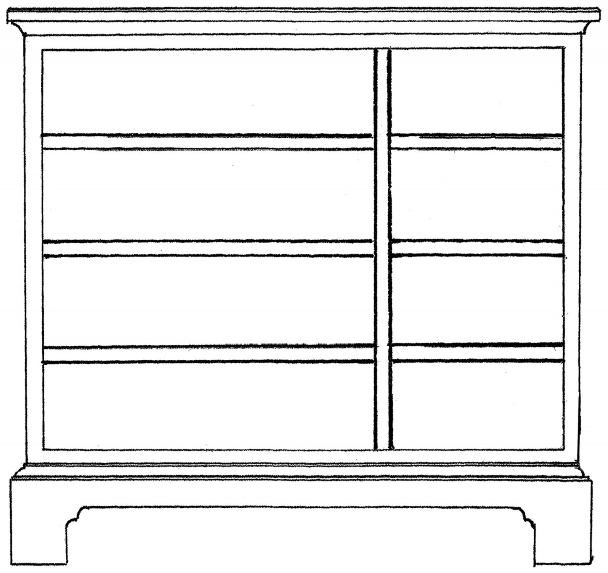
3. Note how dividing up our square into these major parts, instantly gives the form an architectural feel.
Proportions are key to creating a design with life and avoid a static appearance. Think of them as how one part relates in size to the parts nearby as well as to the whole. Take a look at your hand. Your fingers all relate in size to each other as well as to the size of your hand itself and also to the size of your entire body. Your fingers would look static (and artificial) if they were all the same size. Conversely if one finger was a half inch longer or shorter than it is now, it would not go unnoticed. It’s all about sizing different elements in a design and learning to compare them with other parts as well as the whole.
Proportion from Top to Bottom
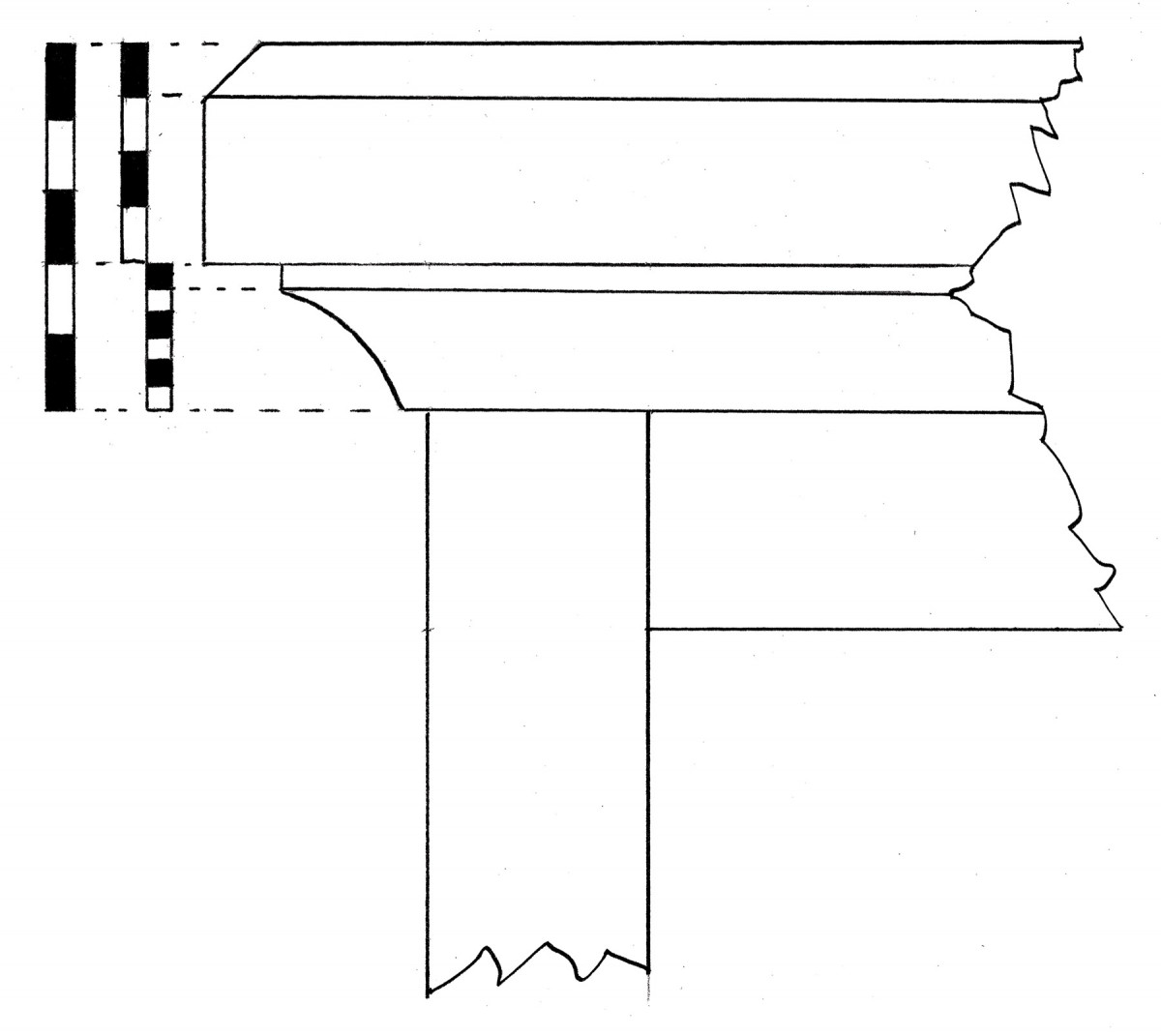
4. The top and molding play off each other. Note the proportions that detail the chamfer on the top and the small fascia on the cove molding.
We begin by dividing up our square vertically and establishing the major parts. Our eyes process things from the ground up. Maybe it goes back to the necessity of sizing up an adversary to determine whether to approach or flee. Traditional designs often divide up a space vertically into a beginning, middle, and ending just like a good story. In our project the beginning is the Plinth or base, the middle is the case, and the ending is the top and the molding just below the top. Beginnings and endings also serve as borders that define the middle or case area that houses the drawers. Think of them like a picture frame that compliments a painting.
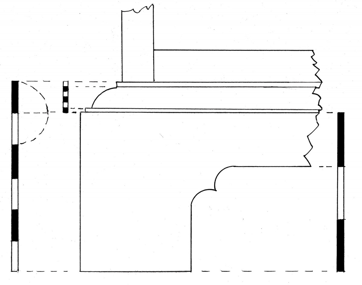
5. Note how the cutout in the base is offset rather than just splitting the height in half.
To establish the height of the base, use dividers to step off the overall height of the square into equal parts and use the bottom part to mark the height of the base. On this project my base ended up being one sixth of the overall height. You can mock something up with cardboard and stand back and look at it to judge whether it looks too heavy, light, or just about right. Trust your eye. If one sixth looks heavy, divide the overall height into eight parts and use one eight to size it. Still too heavy? Keep dividing up the height into 9, 10, or 12 parts. Eventually you’ll hit a spot where it looks right. Next I sized the overall height of the top along with the molding just below the top. It will look top heavy and static if you size it the same height as the base so it helps to lighten it up. In this case I made this portion one third the height of the base. You can think of the top section as a small crown molding like you might see on a taller cabinet or the top of a wall. If this were a taller cabinet where you view the crown from below, I might make this top section one half the height of the base or two thirds. Since this dresser top is viewed from above, the emphasis on the crown is subdued and scaled much smaller.
Details, Details, Details
6. Grids are common layouts for drawers. They’re efficient, but tend to look static.
 Actually there are two aspects of this design that gives it a more contemporary feel. One is the use of a clear finish on this figured maple rather than using a stain to darken the tone. The other is to simplify moldings and edge treatments. It employs a simple chamfer on the top rather than a more complex curved profile and simple cove and ovolo moldings on the base, drawer edges and under the top. Contemporary or not it helps to have some moldings to transition between the base, case, and top. With the base and top height defined, we can drill down and work out the smaller sub elements. When using proportions to work up a design, always work from big to little. That means we establish our rectangular form, break it up into major parts, and then work out the details within those major parts. On the top (ending) the height is divided into five parts giving three parts to the top and the remaining two to the cove molding below it. Note how the top and molding are sized differently to avoid looking static. The base (beginning) is divided into five parts and the top fifth is extended up one part to set the height of the molding above it. The base is also divided into three parts and the bottom two parts set the height of the cutout that runs across the bottom of the base. All these proportions on the façade turn the corner and repeat on the sides.
Lay Out the Middle
That leaves us with the drawer layout that occupies the bulk of the space in the case. If we were just interested in efficient use of space and ease of manufacturing just make all drawers identical. Instead I chose to use a timeless and pleasing arrangement of graduating the drawers. Each drawer is shorter than the one below it by the width of one drawer divider. I wrote about how to execute this layout in the June 2009 issue of Popular Woodworking as well as in the book “By Hound and Eye” through Lost Art Press. Figure seven illustrates a few other drawer configurations to break up a static grid like design.
Proportions to the Rescue!
7. Here are two alternative drawer layouts to give visual interest.
 Once I had the design worked out, I did a cardboard mockup in the foyer to get final approval from Barb. “Time out”, she said. “Now that I see it full size, it’s too tall and wide”. We knocked about three inches off the height and length. Thankfully, that was a minor bump in the road, because all the parts were based on simple proportions on our square façade. It was just a matter of stepping off the same proportions onto a slightly smaller square.
Due to space, I haven’t spelled out every proportional detail in this design. Feel free to explore my drawings and to see if you can smoke out some of those finer details. This will help to train your eye and also help you to unpack the thinking behind this design. For more practical information about this traditional approach, you can find it in a book I co-authored with Jim Tolpin “By Hand and Eye” published by Lost Art Press. PW
George is the co-author of three design books and writer of the By Hand & Eye blog (with Jim Tolpin). See more at www.byhandandeye.com.
Here are some supplies and tools we find essential in our everyday work around the shop. We may receive a commission from sales referred by our links; however, we have carefully selected these products for their usefulness and quality.